Fonts
Our fonts combine warmth and humanity with clarity and professionalism.
They appear modern, friendly, yet serious—just like our daycare centers: open, international, and trustworthy.
All three font types are available for free, accessible, and compatible with all systems—they work on Windows, macOS, and Linux, in Office applications, and on the web.
This ensures that our communication remains legible and consistent everywhere—both online and offline.
Ubuntu
“Ubuntu” represents community and humanity—a value that shapes our work. Its availability on many Linux systems and as a Google Font makes it technically stable and universally usable.
Character: modern, rounded, and appealing—with an open and inviting design language.
Effect: human, lively, positive.
Usage:
Main headings, claims, and emotional statements.
Ideal for posters, website headers, or large quotations.
Noto Sans
Thanks to its excellent readability and support for many languages, Noto Sans can be used worldwide. It is one of the standard fonts on many systems, including Linux, and provides a calm and professional typeface.
Character: simple, clear, and highly legible—with a neutral and friendly appearance.
Effect: accessible, calm, matter-of-fact.
Usage:
Body text on websites and in print materials
Information for parents, newsletters, emails
Noto Serif
Complements the sans-serif fonts with depth and seriousness. It is also available on most systems and can be easily loaded online via Google Fonts.
Character: classic, serious, and elegant—with subtle serifs for good readability.
Effect: trustworthy, stable, competent.
Usage:
Quotations, guiding principles, conceptual texts.
Long paragraphs in official documents or brochures.
Colors
#6CBF4F – Grass Green
The central green in the logo symbolizes vitality, growth, and closeness to nature. It is used for text, buttons, and decorative elements, expressing energy and confidence.
#FFFBAB – Sun Yellow
Bright and friendly yellow, used in the header area and as a contrast to green. It conveys a sense of freshness, agility, and a positive atmosphere.
#FFFFF9 – Warm White
Our basic background: soft and warm white, which appears more pleasant than pure white and integrates well with yellow and green.
#E1ECCF – Light Green
Soft and calming light green, excellent as a background color alternating with warm white, conveying a sense of lightness and openness.
#2F4F3E – Dark Green
Bold and deep green that radiates calm, trust, and stability. It is used for large headings and ensures clarity and stability in the overall appearance.
Our Logo
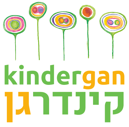
The rainbowtrekkers logo is the central visual element of our corporate design. It features five colorful flowers, hand-drawn—originally designed by one of the first mothers at the facility. They symbolize growth, naturalness, and the diversity of life. The rounded shapes evoke a sense of protection and security, while the vibrant colors recall the rainbow as a symbol of diversity.
The rainbowtrekkers lettering uses the Ubuntu font in a fresh and vibrant grass green. The combination of organic illustration and clear typography represents what defines us: a modern, open, and warm kindergarten culture where children can grow in their uniqueness.